The environmental graphics program for the Land of Lincoln Credit Union was designed to highlight their history, brand, and educational and financial services they offer. Patrons are welcomed into the facility by a large graphic of Abraham Lincoln located behind the information desk. The teller stations are located at the back of the store adjacent to an iPad checkout, waiting area, coffee / tea bar, and kids interactive fun zone play area. Graphics in these areas incorporated both the LLCU color palette and brand.
On the exterior of the building decorative window graphics incorporate their iconic apple logo. Near the drive thru lanes a colorful identity brand shows the LLCU tag line “Bank on Learning More”.
- Wall, Window and Back-Lit Graphics
- Graphics are Applied to Interior and Exterior of the Structure
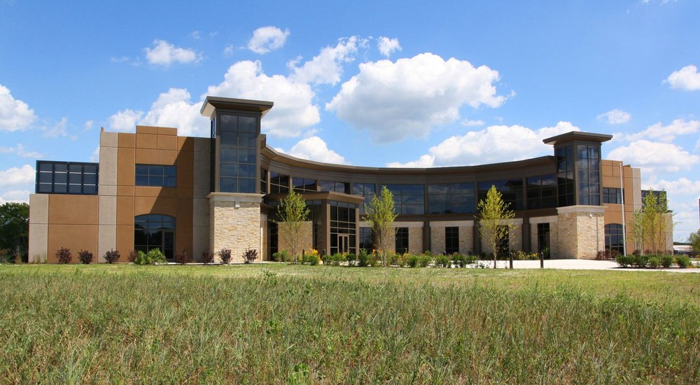
White Construction Company asked BLDD Architects to design its new corporate headquarters that has become the hub for the company that operates in the United States, Canada, and Mexico. This 50,000 square foot office facility houses the administrative, technical, computer and management centers for the entire multi-million dollar company.
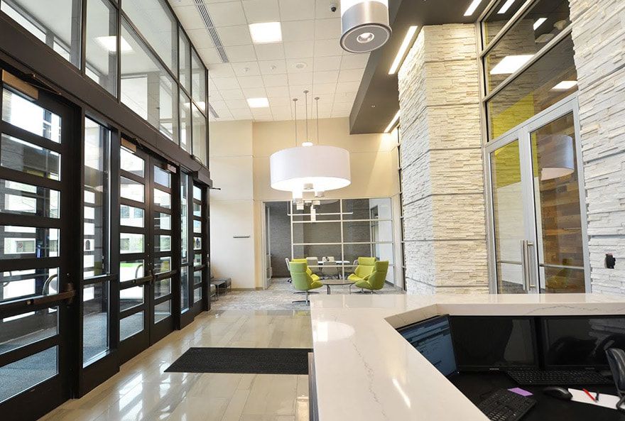
The 80,000 s.f. renovation of this Information System Services building created a collaborative, efficient, and forward-thinking work environment for the company’s IT staff. Through the updates, the owner was able to consolidate various divisions into one space, while also bringing vital leaders to a common area to increase synergistic efforts.
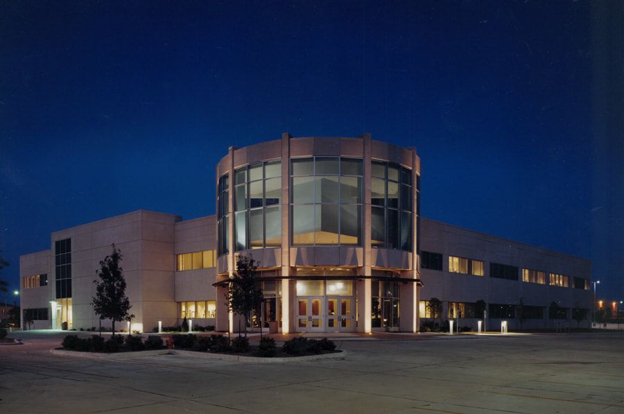
This 127,000 s.f. building consists of a basement including training rooms, mechanical spaces, and an employee lunch room with a walk-out landscaped plaza; a first floor consisting of offices for the Trust Department featuring a three-story lobby and reception area; and a second floor including open offices and conference rooms. The building is designed to match the architecture of the existing corporate offices which are adjacent to the site.